The Formidable Evolution of Public Finances
We review the financing strategies of nation-states. Using basic demographic, economic and fiscal data, we assess the sustainability of public policies in the US, Europe, Japan, or developing countries.
The Logic of the Keynesian Entitlement Trap
Most developed countries had demographics with the typical pyramid-shape or at worst rectangle-shape in the 1950s. Since then, the shape becomes either that of a rectangle or of a spinner. The case of Japan below illustrates the three states:
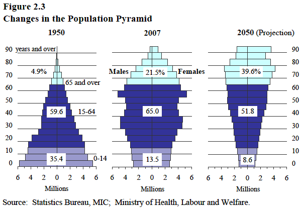
Public health initiatives created solvent demand for treatment and organized generalized vaccination. This led to a formidable progress of life expectancy. Infant mortality went down by a factor of 20, from 10% to 0.2%, and longevity beyond 65 years old increased by 20 years.
With only 3% of the population above 65 years old, a PAYG (pay as you go) pension was cheaper to service in 1945 than a savings based one. It would have remained that way without the continuous expansion of longevity due to better healthcare.
- healthcare was cheaper as medical treatments were less developed
- pension was a cheap promise when only 3% of the population lived above 65 years old.
One could not foresee the coming progress in life expectancy in 1945. However, after 1965, it was clear that PAYG pension and healthcare needed structural reforms. The increased life expectancy at 65 had increased and fertility rates had fallen below 2. The inability to reform is one of the major failures for some democracy: administrations report a headline net annual number for the current year. The incentives of the administrators are such that only optimistic long-term scenarios are used for projections. These projections prove disappointing and public debt is issued. Future earners are made to pay for past and current spending.
Did the age pyramid give someone the idea to finance pensions as a pyramid scheme?
Alternatives to the PAYG system also have problems. DB (defined benefit) schemes are meant to provide for their members a guaranteed pension using returns from risky, non-guaranteed investments. This leads to an accumulation of systemic risk for the scheme provider and a loss of choice for the member. When actuaries proposed to increase all asset returns assumptions, municipal employee DB schemes assets were raided by politicians to finance clientelist projects in 1999. The governance structure turns a speculative prognosis into political action.
DC (defined contribution) does not have these governance problems, as every member decides what risks he takes and at which point he takes them. A DC scheme avoids the governance problem by letting members decide. The only problem left for DC schemes is that the annual fees in some countries are still above 1.5% whereas the UK and US have index fund investment options below 0.2%.
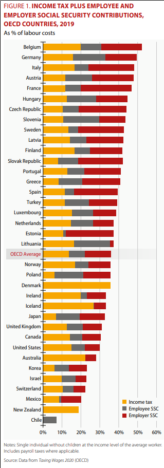
OECD Tax Wedge: Official numbers translucent enough to show reality
We reproduce a chart from the OECD. This OECD ranking comes with a caveat: an editorial choice was made to display a single tax rate despite considerable dispersion for each country. While it is the case that more than 80% of the tax is paid by less than the 20% richest, the editors chose to show the rate paid by the average earner. We can expect that the marginal average rate at which tax has been levied is in fact nearer to the top marginal rate. Fiscal pressure is best measured where it is exerted.
The distinction of employer and employee social contribution was certainly relevant when the system was put in place. This happened before or around 1945 for most countries. It is economically indifferent to staff who were hired after 1945. We see data that was irrelevant for 70 years still being reported because it is available, whereas the split between healthcare and pension financing cost, which is now relevant is not reported.
The employer and employee social contributions tend to be more stable so that the chart below shows the fundamental difference between countries originating from their cost of social security. Health services can be provided for 5%-10% of a developed country's average wage. Retirement benefit can be provided for 5%-10% (depending on retirement age and market performance) of a worker's wage when contributions are capitalized.
The cost of PAYG pensions rises with the dependency ratio. It goes from 3% in emerging countries and will reach 50% if the revenue is distributed directly and the population is stable. It will reach higher levels if the fertility rate is below 2.
The problem of the countries that show 30% of social spending in the table below is that they are extorting double to triple the cost of social insurance from workers. This is happening in countries with PAYG or underfunded defined benefit plans where the age expectancy has increased. We can quantify the growing proportion of people aged 65 or above in the population in the demographics section table further below.
The main point is that Japan and much of Europe are highly dependent on PAYG on DB schemes, the notable large country exceptions in the developed world are the US and UK which have a lower dependence on these schemes, although for the US and UK, many legacy situations are still in place.
An important question is: what about the countries that the OECD statistics do not cover. What happens to welfare for paragons of globalized capitalism such as Hong Kong and Singapore, in Panama, Costa Rica, and Georgia. How bad is the situation in Argentina or Venezuela? Are countries with a young and growing population like Nigeria or Congo on their way to replace Europe?
Basic Health, Economic, Demographic, and Tax Data
The table below raw statistical data on countries. The countries have been ordered by social development. An HTML table with the raw data is shown below. The mortality is negatively correlated with the GDP per person (Y/pop column on the right) and positively correlated with fertility (column on the left):
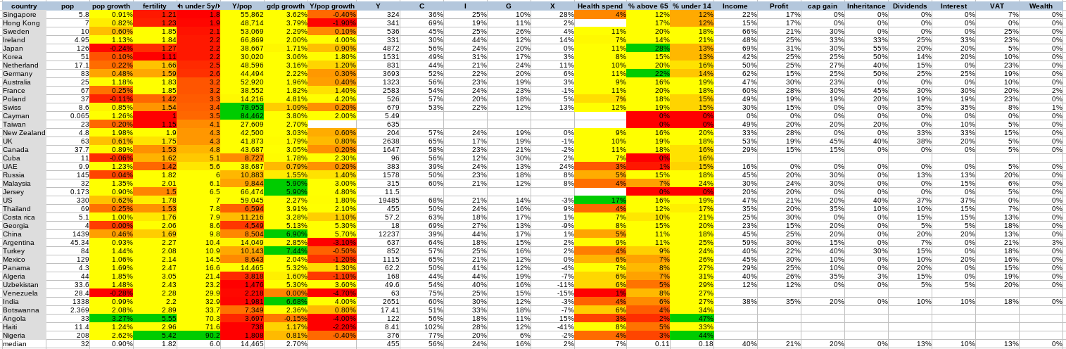
source: the world bank and worldometer combined
The table in HTML format can be found here.
Mortality before age 5 as a reverse development index
Gini coefficients or other inequality indicators show how much equality matters to a given population. While this gives information about a society's values such as solidarity or its tendency to envy, it gives only relative information instead of absolute information on development and economic efficiency for the poor.
When it comes to development, many outcomes such as academic achievement depend on one's life goals and personal preferences. Metrics such as longevity is subject to dietary choices (high meat and butter diet, distilled alcohol are consumption choices available to affluent people, not to subsistence farmers).
Every mother of a young child will do what she can to see him live. Child mortality is a good indicator of how well society helps mothers achieve this goal. The mortality before age 5 provides an absolute number. The mortality number is now between 2 and 90 per 1000 depending on the country.
To give some perspective, a developed country like France was losing 300 of its newborn per thousand in the first year in 1740 and this number went down to 100 in 1945. After that, medical progress and the introduction of universal healthcare reduced this number of 100 to less than 3. The data for the US shows that US that mortality went down much earlier than in France, showing that peace and progress, not necessarily welfare programs is a cause of improvement.
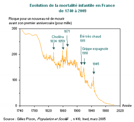

source: US CDC
At present, Nigeria, Congo, Mali have similar mortality numbers of around 90/1000. These numbers are on par with France in 1950 or the USA in 1920. These are the worst-performing countries that we covered in 2020.
This is a testimony to a dramatic improvement of public health that came since the 50s. The scientific and technological benefits were quickly shared around the world after the war. The US precursor role shows that significant progress could happen without wellfare state, but universal healthcare probably helped.
Here are a few patterns we note from observing the data in the table:
- Rich countries tend to have better outcomes, but it is not only about money. There is a social component: Poland and Korea are amongst top performers despite a much lower income per capita
- Redistribution is high in core OECD countries but results vary. The two top healthcare countries are Singapore and Hong Kong, despite high inequality. The next best country we covered, Sweden is third but levies high taxes.
- Rich countries such as the US, Argentina, and Panama have poor results, Argentina insists on social justice and high tax without delivering to basic healthcare to its citizen. Panama has low tax and high income but healthcare performance for the poor is lower than that of the four Asian dragons.
- Some countries like Botswana (33) are touted as examples of development whereas Argentina (10) and Venezuela (30) are said to be failed states. These comments refer to the trajectory of the states compared to where they were 20 years ago, but the absolute numbers are still much better for Argentina than Botswana.
Science and Technology
Scientific and technological achievement is not only linked to welfare for the poor or wealth. The leading nations shown by the number of Fields medalist are US, UK, France, Russia, Japan. Using Physics Nobel prices, we see US, Germany, France, UK, Italy. Still, the US is a leading scientific nation despite paltry results on infant mortality compared to Poland,
The brain drain allows some countries to attract the elite and the most brilliant from developping countries would readily go study in the US rather than in their local university. UK and France also benefit from an inflow of students from their former colonies. The USA, a country of libertarian trappers and cowboys, was an academic backwater compared to Europe until the world wars brought the brightest minds there. The reasons appear more historical and social than economic.
Fertility, Population and Environment
For developing countries, we see higher fertility in countries with the highest infant mortality. Fertility overcompensates mortality. This leads to population levels unheard of in the history of these countries. This may lead to environmental problems the like of which we see in Haiti. Countries with the highest fertility and the worst infrastructure such as Nigeria, Mali, Congo are the most likely to overexploit their ecosystem by deforestation or pollutive extraction of exported raw materials.

Image credit: Wikicommons
Tax, Inequality, and Incentives
In 1993, Murphy, Schleifer and Vishny noted that non developing countries have very few private companies (oil and mining companies) willing and able to deal with government red tape. Most of the population was living on subsistence farming or government rent-seeking. These are countries were administration developped faster than the private sector during decolonisation.

Image credit: Wikicommons
Some developed countries politically unwilling to properly account for their entitlement system, let alone reform it. Their fiscal income is limited in theory by the Laffer curve. As tax increases and opportunities for extracting government rent appear, people switch from taxable activity to government rent-seeking or to less productive but non-taxable activity.
France, Italy, Spain, and Portugal have similar incentive problems. To illustrate the problem numerically, France has 16 million voters dependent on state pension financed by levies on its active population. Among the 26 million actives, there are 3 million unemployed and 5 million civil servants. This means that there are currently 24 million voters dependent on the public funds and 18 million voters working in the private sector. While progressists contend that this level of public sector funding is woefully insufficient to correct the market failures, a large public sector begets the possibility of government rent-seeking.
If one was to measure a Laffer effect by comparing countries and growth, the tax level reported by the OECD is misleading. The disincentivizing effect of marginal rates is felt by those who pay the majority of the tax, and the majority of the tax is not paid by the average taxpayer but by the top earner.
We independently checked the marginal tax rates using Deloitte data from their tax highlights to obtain top marginal tax rates and to see how the actual rate paid by those financing the states is impacted.
We see three categories of developed countries:
- low tax (Singapore, Hong Kong, Jersey, Cayman)
- medium tax (Switzerland, US, Korea)
- high tax (Sweden, Japan, France)
Tax Heavens and Hells
In theory, the tax that causes the least distortions to incentives besides zero tax is the lump-sum tax. Many countries opt for zero tax but only Jersey implements something akin to a lump sum tax, with a single proportional tax at a rate of 20% up to a certain sum, after which the marginal rate falls to 1%. Sark, a smaller channel island, implements a simpler low tax based on land ownership, doing away with the need for a tax administration. The opposite example would be the US tax system, the 1986 reform, and the 2017 TCJA introduce more complication, and income categories were invented such as "passive activity loss", "unrecaptured amortization gain" and "qualified beneficiary income" having special rates and deductions.
The low tax countries are usually dismissed as smaller tax heaven doing fiscal dumping, but the case is more nuanced than the OECD bullies claim. The highest tax jurisdictions such as France and Japan offer relief to non-domiciled persons settling in, Portugal offers tax relief to attract pensioners from other EU countries, Ireland allows large American companies to avoid tax while levying high tax on its residents. The large countries have no qualms offering lower taxes to attract new clients while taxing away their locals. Some small low-tax countries such as Malta or BVI have indeed higher tax for local companies than for foreign ones, but many small countries give the same deal to their residents as to non-domiciled persons.
Small countries have first developed as trading centers when they were too small to support a large administration and never taxed their residents to such a degree. The bigger countries always bore the cost of supporting a standing army and had taxes, they are the ones complicating their tax codes. As a consequence, small countries had tax systems that were always simple.
The OECD Conspiracy Theory
In 2010, french president Nicolas Sarkozy successfully convinced major OECD countries to set up a cartel to force fiscal disclosure from small countries. A symbolic landmark was the end of banking secrecy in Switzerland. Germany succeeded to coerce Switzerland to repeal its secrecy law. The swiss had resisted chancellor A. Hitler but relented to chancellor A. Merkel. Since 2010, the introduction of FINRA and CRS reporting obligations for banks enforces high compliance costs on banks. CFC (controlled foreign corporation) reporting rules and economic substance requirements for offshore companies increase the reporting requirements for all and make the cross-border investment much, pre expensive. Most banks now refuse to open a bank account for BVI or Seychelles incorporated companies for most but the richest entrepreneurs.
The OECD fiscal cartel becomes more forceful as its members' situation become desperate, it is currently setting up a data collection network. It is unlikely however that the cartel members would continue to hold together as some have a much higher burn rate and can be expected to implode before the US and UK.
The medium and high tax developed countries that finance their entitlements using the PAYG pyramid scheme will face pension financing pressure that will cause them to increase tax pressure. Japan is engaged deepest in the entitlement trap, France has a higher fertility but a majority of the voters owe their income to the state..
The Engine of Growth
Given my firsthand experience with France, UK, Japan, the US, and Hong Kong, I expected to find that low tax leads to a better outcome. After looking at the facts, my conclusion now is that there are other social and historical factors at play.
- countries with high wealth have a harder time growing quickly, we see that Singapore and Hong Kong do not grow much more than Europe or Japan on a per capita basis.
- the US higher GDP growth is driven by healthcare and education. These sectors do not benefit from technological productivity gains, and their inefficiency and driving much of the increase in GDP.
- the development of Singapore and Hong Kong from 1970 to 2000 show that a welfare state is not required for growth.
- the development of France and Italy from 1945 to 1970, countries with low trust levels compared to Sweden or Germany, show that a welfare state does not impede growth.
- the inability of Portugal and Greece to catch up with France and Italy despite European subsidies show that a welfare state does not promote growth.
- China and India growth story are all about catching up and a 6% to 10% growth can be seen as natural (as it was in Europe after WWII),
- some other countries that should have been catching up are stuck in non-development ever since their independance. The lack of development of countries such as Mali, Congo, or Nigeria point to a series of social and cultural problems.
There are two avenues to consider the factor of growth:
- science and technology are key drivers of future growth and would be subject to another article as there are many historical and cultural drivers that enable a brain drain.
- private ownership rights and rule of law enable capital investment that is not subject to hijacking by coercive government rent-seekers.
Those depend on factors that are socio-cultural and historical development. They are more qualitative and would be the subject of another article.
Sustainability and Next Generation
There is another point we need to make based on the statistics shown here: the world currently carries 7bn people and will have 10bn people once the generations from fast growing countries grow up. Given concerns such as agricultural land productivity, and mineral and energy use, going back to a lower population over a long time horizon appears preferable.
Countries such as Sweden, Ireland, Australia, France still a relatively high 19% to 21% population below age 14, which indicates the age pyramid is rectangular.
The age pyramids of Japan of the first graph show what happens eventually to developped countries after fertility has been down. This is the case for Japan with Germany and Italy following next.
Some other countries such as Singapore and Hong Kong have less than 12% population below age 14, which means that dependency ratio is still low because there are few children. It is preferable pensions and healthcare are being funded through savings rather than through PAYG systems. This avoids systemic risks.
| Tweet |
|